 |
Since November 2016, the main Google search index is mobile |
While Google Search Result Pages has always been based on desktop version of the websites, is now the mobile version which significantly indicate Google Search Core Algorithm Changes.
Mobile, The Google First Priority
Why Does Google Priority The Mobile-First Search Results?
As Google explained in its webmaster central blog official announcement at Nov. 4, 2016, the change was necessary because of the paradox:Today, most people are searching on Google using a mobile device. However, our ranking systems still typically look at the desktop version of a page’s content to evaluate its relevance to the user. This can cause issues when the mobile page has less content than the desktop page because our algorithms are not evaluating the actual page that is seen by a mobile searcher.
The announced change therefore makes more coherent analysis of Google:
To make our results more useful, we’ve begun experiments to make our index mobile-first. Although our search index will continue to be a single index of websites and apps, our algorithms will eventually primarily use the mobile version of a site’s content to rank pages from that site, to understand structured data, and to show snippets from those pages in our results. Of course, while our index will be built from mobile documents, we're going to continue to build a great search experience for all users, whether they come from mobile or desktop devices.
In the next paragraph google assured that, although this is a big algorithm changes but all user still get great user experience as always.
Is Google Mobile-First Index Already in Place?
No, I don't think so, Even the announcement is official made since early November 2016, Google's Mobile-first Indexing is still in a testing phase. As the impact can be major (for small businesses, blogger, solopreneur and professionals to make sure that their websites are mobile friendly, for example), Google warned in advance.Is The World Really Happened To The Mobile?
I went to see the Global internet usage statistics provided by web analytics company StatCounter, what I found is very interesting: StatCounter Global Stats found that mobile and tablet devices accounted for 51.16 percent of worldwide internet usage in November 2015 to October 2016, compared to 48.48 percent via desktop. Indeed the trend is globally clear. |
| Proportion of Internet Usage WorldWide in October 2016 |
But when I looked closely at the comparison map, I realized that Mobile usage surpasses desktop for geographical areas like Asia and Africa where the mobile has majority share, but this is not the case of Europe, Canada, United Kingdom, Australia and Even United States of America (But For How Long?).
In USA, there would be only 36.5% of digital media time represents by Mobile, while the desktop is 63.50%.

In Canada, there would be only 26.96% of mobile internet user compared to 73.04% of desktop internet user.

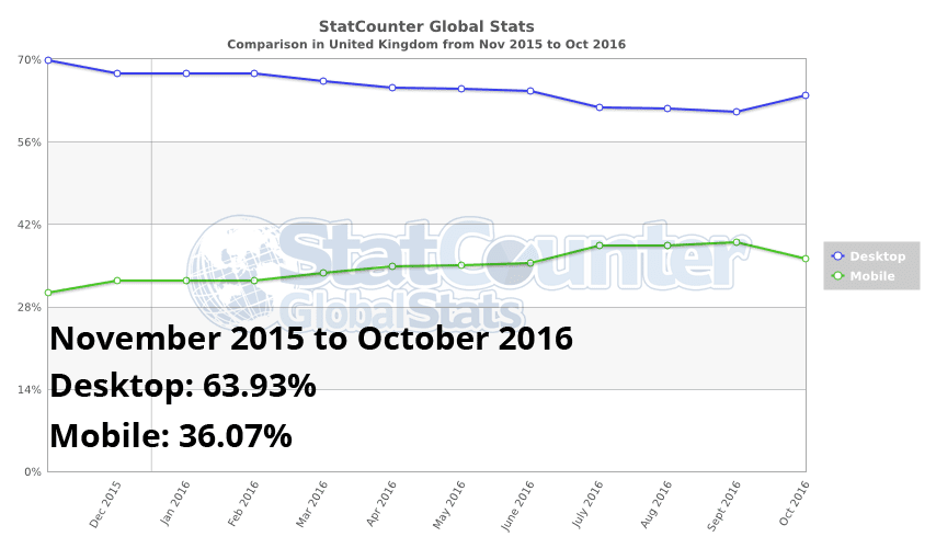
In United Kingdom, While an estimated of 89.90% of U.K. citizens using the internet today (Source: https://hostingfacts.com/internet-facts-stats-2016/) , there would be only 36.07% of mobile internet user.
Global Mobile Consumer Survey 2016 UK Cut: Deloitte Touche Tohmatsu UK Limited conducted an SmartPhone Usage Survey, Here're the Key findings:
- Almost half of 18-24 year olds check their phone in the middle of the night.
- 27% of smartphones include a fingerprint reader, of which 76% are used.
- Connected home devices still haven’t taken off, with just 2% of adults owning smart lights and smart appliances.
- As of mid-2016, almost half of UK adults had access to at least one type of connected entertainment product.
- 4G adoption has more than doubled in the last year, from 25% to 54%.
- 31% of smartphone users make no traditional voice calls in a given week. This contrasts with a quarter in 2015, and just 4% in 2012.
- The majority of survey participants have downloaded 20 or fewer apps.
- By mid-2016, almost two-thirds of UK adults had access to a tablet, but penetration growth had slowed down.
In Australia, there would be only 37.76% of mobile internet user compared to 62.24% of desktop internet user.

In Europe there would be only 31.22% of mobile internet user.

What Difference Does It Make In Practice?
It depends on whether your website is mobile-compatible, and if so in what way (there are 3 ways).Mobile websites via responsive design:
In this scenario, the website automatically adjusts to the available screen width (in pixels). The website URL will the same (between the mobile version and the other) and no detection of the type of media device is required. If this is your case, you have nothing else to do than to check what happens when Google visits your site. Please, test your website with Google Mobile-Friendly Testing tool.Mobile websites via the dynamic serving:
In this case, the design automatically adjusts to the available width (in pixels). The URL is the same (between the mobile and the other version). The only difference with responsive design is that the content (source) differs depending on the type of media device (which must therefore be detected), the idea being to ease the mobile version. If this is your scenario, you have nothing else to do than to check what happens when Google accesses your site. Please, test your website with Google Mobile-Friendly Testing tool.Mobile version of your websites via a new mobile only URL:
In this scenario, two sites (or pages) are created: one for the desktop browser & the other one for mobile user. There are quite a few things to do for Google sees this mobile-compatible, but if it is OK then it is as effective (in terms SEO) than other methods. If this is your case, take a step back and ask what is different (in terms of website content and structured data markup) between the mobile version and desktop version.If your website's mobile version has less content than the other version, then you risk seriously to see your Google organic search traffic decrease, especially on the long tail keywords. Indeed, removing words or phrases, you reduce your chances out in the SERPs on queries that reference.
Websites that do not compatible with mobile:
In this case, it really is time to plan a new version of your website, obviously compatible with mobile! Because not only do you risk having problems in SEO (Google based on the mobile version first), but most of your website user will not be happy website your website.A Mandatory Test For Everyone!
Be sure to follow these 3 essential tips:- First, test your website with google new mobile compatibility testing tool to make sure your site is compatible according to Google guideline. You should test your website all URL individually, because Google tool only evaluates the URL we provide not all of it's inner pages.
- Then run the "Fetch as Google" tool in Google Webmaster Tools interface. Remember to configure the search robot to mobile version (it is still not selected by default ... like what Google is outdated). I advise you to enjoy it to request a display, you can render your page according to Google. It is on this version that Google will now be based to estimate the quality of your site.Suffice to say that it is imperative that everything is OK! By the way, make sure you do not block Google's access to resources necessary for rendering on mobile ( CSS , JS , images).
- Finally, test your website with google's structured data markup testing tools. And see if you inserted structured data markup correctly (like Organization, Address, etc). Reread the article in Google Webmaster Central and you'll see they speak several times about structured data markup, as it is important.
Read This Week SEO Trend.
EmoticonEmoticon