Showing posts with label Mobile Search. Show all posts

Things You Need To Know About Google’s ‘Mobile-First’ Indexing


Here's everything you need to know (technically worry) about the Google Mobile-First Search Index.

Why Does Google Switch To ‘Mobile-First’ Search Result?

Google's internal research found that the majority of Searches on Google are done via Mobile devices. Google's aim to deliver relevant results to the majority of their searchers. Until now, Google has indexed web pages as desktop browsers see them. With the new ‘mobile-first’ search index approach, Google indexes web pages as mobile phones see them. The rankings will be based on the mobile websites priority then desktop website.

Nutshell is the mobile version of your website will become more & more important for SEO than the desktop version.

What is Changing with the Mobile-First Search Index?

As more and more google searches happening on mobile, Google wants its index and results to represent the majority of their users — who are mobile searchers actually. Google has started to use the mobile version of the web as their primary search engine index. A search engine index is a results of pages/documents that the search engine discover, primarily through crawling the world wide web through links. Google has crawled the web from a desktop browser point of view, and now Google is changing that to crawl the web from a mobile browser view.

The most substantial change will likely be that by having a mobile index, Google can run its ranking algorithm in a different fashion across “pure” mobile content rather than the current system that extracts data from desktop content to determine rankings.

What if You Don’t have a Mobile Friendly Website?

Google said not to worry. Although Google wants you to have a mobile friendly website, it will still crawl your desktop version of your website instead. Google said,
If you only have a desktop site, we’ll continue to index your desktop site just fine, even if we’re using a mobile user agent to view your site.
If you have a mobile friendly website, then you need to make sure the website content and links on the mobile site are similar enough to the desktop version of your website, so that Google can consume the proper content and rank your site as well as it did by crawling your desktop website.

Test your website with Google's New tool.

Don't Have a Mobile Friendly Website? Contact Here

What do You Have to Do if you Have a Mobile Friendly Website?

You have to make sure that your mobile website contain enough related & high quality content to rank your pages on google search. If your mobile website have less content than your desktop pages, your pages might get lower rankings with Google’s new ‘mobile first’ search index.

My Mobile Site has less Content than my Desktop Version. Should I be Worry?

Potentially, yes you should worry about it. Google has said that it will look at the mobile version of your site. If that has less content on webpage "X" than the desktop version of webpage "X", then Google will probably just see the mobile version with less content. This is why Google recommends you go with a responsive design approach — the content is the same on a webpage-by-webpage basis from your desktop to your mobile website. You can do the same with other mobile implementations, but there is more room for error.

What is the Best Solution to Make Sure that Google can see the Content of My Webpages?

Google Recommends responsive web design. The content on responsive websites is the same on desktop computers, tablet and mobile devices. The layout changes based on the media device that is used to view the content but the content is the same. Of course, you can also create a separate website just for serve mobile.

Responsive websites will benefit the most and will be well placed for the change. However, websites which have a separate mobile site will suffer the most as a strong focus on optimization will be necessary to get them up to speed if they’ve been neglected in the past.

In general, a separate mobile website lead to more work and more errors can happen.

What About Expandable Content on Mobile Device?

With your desktop sites, Google said that content hidden in tabs, accordions, expandable boxes and other methods would not be weighted as high. But when it comes to mobile search index, Google’s Gary Illyes said content like this will be given full weight if done for user experience purposes. The idea is that expandable content makes sense on mobile device and not so much on desktop.

Will My Rankings Change a Lot?

At the moment, it’s still too early to say about it. But note it, that Google is prioritizing mobile content.

Google's Representative says that there should be minimal ranking changes around this algorithm change. Of course, most websites already have good mobile friendly or responsive sites. If you do not have a mobile friendly website yet, your rankings might change more than the rankings of a website that already is mobile friendly. Pages that are not mobile-friendly will not rank as well as pages that have been optimized for mobile devices.

I suggest a SEO audit ? Contact Here

Will Google Have Different Indexes for Mobile Search and Desktop Search Results?

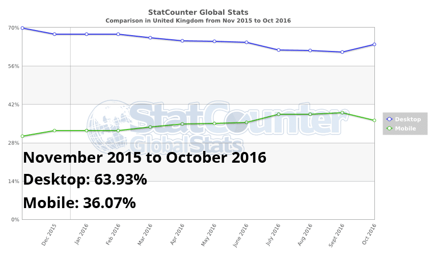
We know Google has been working on creating a separate mobile index for a while now, but with mobile searches now accounting for more than 50% of all searches, it’s making more sense to priorities a more relevant and positive user experience for users on mobile devices.

Although we’ve had some pretty obvious clues that Google search is become more mobile-orientated with the advent of ‘Mobilegeddon’ The Google Mobile Friendly Update On April 21, 2015 and the introduction of AMP in February this year, it’s now clear that Google is taking his search algorithm a step further.

Currently, Google search is set to become mobile-first & has a single index for search across desktop and mobile, but last week Google’s Gary Illyes confirmed at Pubcon in Las Vegas they are going to create a separate, rapidly updated mobile search index, which will become the primary index used for search.

A secondary desktop index will be in place, but won’t be as up-to-date as the mobile index. We don’t know exactly when the changes will be rolled out, but it will likely only be a matter of time.

When Will This Fully Roll Out?

Google's Representative said they have already begun testing this mobile-first search index to some users. But it looks like we are still months away from this fully rolling out. Google won’t give us a date because they are still testing the roll-out, and if things go well, they may push it sooner. If things do not go well, they may push it back. Google did say they will push this out to more and more searchers over time as they become more confident with the mobile-first search index.

What Happens to the Links that Point to My Website?

If you have a responsive website, you do not have to worry about this because the URLs of your mobile pages and your desktop pages are the same (actually, the pages are the same, they are only displayed differently on mobile and desktop).

Is This a Mobile-Friendly Website Ranking Boost?

Google has previously said that the website content that’s not mobile-friendly will not rank high on organic search. That remains the case with this new index too. In the current index, which most people will continue to get results from, desktop content is indexed and used for showing search listings to both desktop and mobile users.

A special mobile-friendly ranking system is then used to boost website content for Google’s mobile listings. Content that’s not mobile-friendly doesn’t perform as well. In the new mobile-first index, which some people will get results from as Google rolls it out, mobile content is indexed and used for showing listings to both desktop and mobile users. Then the mobile-friendly ranking boost is applied, as with the current system, to mobile-friendly pages.

Want to Boost Your Website Ranking? Contact Here

How Can I Tell if Google Sees My Mobile Pages?

The best way is to use the Fetch and Render tool in the Google Search Console. Specify the mobile:smartphone user-agent and look at the preview after the fetch and render is complete. What Google shows you in the rendered results is likely what Google can see and index from your mobile website. If content is missing, then you should look into how to fix that and run the google tool again.

Will Links and Rankings Change Because of This?

There is a concern that mobile content tends to have fewer links than desktop content. This is a concern that is similar to the concern listed above around mobile content having less content than desktop content. Google’s search results are very dependent on links and content. So if both links and content are impacted, will the rankings be impacted? Google said they are still testing, so it isn’t 100 percent clear. Gary Illyes said,
I don’t want to say anything definite about links yet. It’s too early for that cos things are very much in motion.

Canonical URLs: Shall I Need to Change Them?

Google said the canonicals will not need to be changed, just keep your canonical tags as is, and follow their recommendations as listed on their blog post. They Said,
Sites do not have to make changes to their canonical links; we’ll continue to use these links as guides to serve the appropriate results to a user searching on desktop or mobile.

Can I See the Change and The Impact in the Search Results Now?

Google said you shouldn’t be able to see the change and impact of the mobile-first search index roll-out now. In fact, Google said it hopes there is little to no impact after it is fully rolled out. Paul Haahr Software engineer at Google said,
I would be very surprised to detect any effects of mobile-first indexing at this stage.

Will Bing Search Move To Mobile First Index Too?

Some have been wondering if Bing Search Engine would follow in Google’s footsteps and do a Mobile First Index, similar to what Google recently announced. Google will be changing their desktop index to one where they index the mobile version of a website, in order to serve mobile users – which now account for more than 50% of all searches – the most accurate search results.


Christi Olson Bing Evangelist at Microsoft says that they have no plans to do a Bing “mobile first” index. Their index will remain as a desktop index, meaning they will continue to index the desktop version of a webpage, and not the mobile version of the page. She Said,
At Bing, we maintain a single index that is optimized for both mobile and desktop to ensure our users continue to receive the most relevant, fresh and consistent results no matter where they are.
Want To Rank Higher on Bing & Yahoo Serch? Contact Here

Although Google said they have already begun testing this mobile-first index to some users, it will still take some time until it goes live for all users.

Priority to the Mobile at Google Search

Mobile at Google Search
Since November 2016, the main Google search index is mobile

While Google Search Result Pages has always been based on desktop version of the websites, is now the mobile version which significantly indicate Google Search Core Algorithm Changes.

Mobile, The Google First Priority

Why Does Google Priority The Mobile-First Search Results?

As Google explained in its webmaster central blog official announcement at Nov. 4, 2016, the change was necessary because of the paradox:

Today, most people are searching on Google using a mobile device. However, our ranking systems still typically look at the desktop version of a page’s content to evaluate its relevance to the user. This can cause issues when the mobile page has less content than the desktop page because our algorithms are not evaluating the actual page that is seen by a mobile searcher.

The announced change therefore makes more coherent analysis of Google:

To make our results more useful, we’ve begun experiments to make our index mobile-first. Although our search index will continue to be a single index of websites and apps, our algorithms will eventually primarily use the mobile version of a site’s content to rank pages from that site, to understand structured data, and to show snippets from those pages in our results. Of course, while our index will be built from mobile documents, we're going to continue to build a great search experience for all users, whether they come from mobile or desktop devices.

In the next paragraph google assured that, although this is a big algorithm changes but all user still get great user experience as always.

Accuracy: throughout this article, as in the communication of Google unless stated "mobile" means "smartphone". This does not include tablets, which are closer to the computers.

Is Google Mobile-First Index Already in Place?

No, I don't think so, Even the announcement is official made since early November 2016, Google's Mobile-first Indexing is still in a testing phase. As the impact can be major (for small businesses, blogger, solopreneur and professionals to make sure that their websites are mobile friendly, for example), Google warned in advance.

Is The World Really Happened To The Mobile?

I went to see the Global internet usage statistics provided by web analytics company StatCounter, what I found is very interesting: StatCounter Global Stats found that mobile and tablet devices accounted for 51.16 percent of worldwide internet usage in November 2015 to October 2016, compared to 48.48 percent via desktop. Indeed the trend is globally clear.

Google Mobile-first Indexing
Proportion of Internet Usage WorldWide in October 2016

But when I looked closely at the comparison map, I realized that Mobile usage surpasses desktop for geographical areas like Asia and Africa where the mobile has majority share, but this is not the case of Europe, Canada, United Kingdom, Australia and Even United States of America (But For How Long?).

In USA, there would be only 36.5% of digital media time represents by Mobile, while the desktop is 63.50%.


In Canada, there would be only 26.96% of mobile internet user compared to 73.04% of desktop internet user.


In United Kingdom, While an estimated of 89.90% of U.K. citizens using the internet today (Source: https://hostingfacts.com/internet-facts-stats-2016/) , there would be only 36.07% of mobile internet user.


Global Mobile Consumer Survey 2016 UK Cut: Deloitte Touche Tohmatsu UK Limited conducted an SmartPhone Usage Survey, Here're the Key findings:

  • Almost half of 18-24 year olds check their phone in the middle of the night.
  • 27% of smartphones include a fingerprint reader, of which 76% are used.
  • Connected home devices still haven’t taken off, with just 2% of adults owning smart lights and smart appliances.
  • As of mid-2016, almost half of UK adults had access to at least one type of connected entertainment product.
  • 4G adoption has more than doubled in the last year, from 25% to 54%.
  • 31% of smartphone users make no traditional voice calls in a given week. This contrasts with a quarter in 2015, and just 4% in 2012.
  • The majority of survey participants have downloaded 20 or fewer apps.
  • By mid-2016, almost two-thirds of UK adults had access to a tablet, but penetration growth had slowed down.


In Australia, there would be only 37.76% of mobile internet user compared to 62.24% of desktop internet user.


In Europe there would be only 31.22% of mobile internet user.


What Difference Does It Make In Practice?

It depends on whether your website is mobile-compatible, and if so in what way (there are 3 ways).

Mobile websites via responsive design:

In this scenario, the website automatically adjusts to the available screen width (in pixels). The website URL will the same (between the mobile version and the other) and no detection of the type of media device is required. If this is your case, you have nothing else to do than to check what happens when Google visits your site. Please, test your website with Google Mobile-Friendly Testing tool.

Mobile websites via the dynamic serving:

In this case, the design automatically adjusts to the available width (in pixels). The URL is the same (between the mobile and the other version). The only difference with responsive design is that the content (source) differs depending on the type of media device (which must therefore be detected), the idea being to ease the mobile version. If this is your scenario, you have nothing else to do than to check what happens when Google accesses your site. Please, test your website with Google Mobile-Friendly Testing tool.

Mobile version of your websites via a new mobile only URL:

In this scenario, two sites (or pages) are created: one for the desktop browser & the other one for mobile user. There are quite a few things to do for Google sees this mobile-compatible, but if it is OK then it is as effective (in terms SEO) than other methods. If this is your case, take a step back and ask what is different (in terms of website content and structured data markup) between the mobile version and desktop version.

If your website's mobile version has less content than the other version, then you risk seriously to see your Google organic search traffic decrease, especially on the long tail keywords. Indeed, removing words or phrases, you reduce your chances out in the SERPs on queries that reference.

Websites that do not compatible with mobile:

In this case, it really is time to plan a new version of your website, obviously compatible with mobile! Because not only do you risk having problems in SEO (Google based on the mobile version first), but most of your website user will not be happy website your website.

Need Help Setting Up Mobile Compatible Website? Contact Us

A Mandatory Test For Everyone!

Be sure to follow these 3 essential tips:

  • First, test your website with google new mobile compatibility testing tool to make sure your site is compatible according to Google guideline. You should test your website all URL individually, because Google tool only evaluates the URL we provide not all of it's inner pages.
  • Then run the "Fetch as Google" tool in Google Webmaster Tools interface. Remember to configure the search robot to mobile version (it is still not selected by default ... like what Google is outdated). I advise you to enjoy it to request a display, you can render your page according to Google. It is on this version that Google will now be based to estimate the quality of your site.Suffice to say that it is imperative that everything is OK! By the way, make sure you do not block Google's access to resources necessary for rendering on mobile ( CSS , JS , images).
  • Finally, test your website with google's structured data markup testing tools. And see if you inserted structured data markup correctly (like Organization, Address, etc). Reread the article in Google Webmaster Central and you'll see they speak several times about structured data markup, as it is important.

Read This Week SEO Trend.

'Mobile-First Indexing ' Google’s Begins Making a big change to Organic Ranking and Appearance

Google Mobile-First Indexing


As we know, Since 1997 Google has used the desktop version of websites to determine it’s search relevance and organic ranking signals in order to populate its organic search index.

Google has begun testing mobile-first indexing, using mobile content to determine it’s search relevance and organic ranking signals, which will primarily look at the mobile version of your website for its ranking signals and eventually fall back on the desktop version when there is no mobile version available for user search query.

Most of Google Searches are Mobile

Google realized that most people search on Google using mobile devices, and the company has begun experimentation with switching to a mobile-first indexing methodology last year. This will be of particular interest to webmasters, depending upon the configuration of the websites under their management.

A detailed study released by Google reveals roughly 40% of people search only on a smartphone. More people are searching Google via smartphone than ever before the company says, with the most popular categories revolving around health, parenting, and beauty.

Other top findings from Google’s study include:

  • 80% of people use a smartphone
  • 67% of people use a desktop computer
  • 16% of people use a tablet
  • 57% of people use more than one type of device
  • 27% of people use a smartphone only
  • 14% of people use a desktop computer only


Dissecting these findings, it’s interesting to learn that of the people who only use one type of device, twice as many are using smartphones than desktop computers.

Google acknowledged the significance of the undertaking and wrote on the Webmaster Central Blog:

Today, most people are searching on Google using a mobile device. However, our ranking systems still typically look at the desktop version of a page’s content to evaluate its relevance to the user. This can cause issues when the mobile page has less content than the desktop page because our algorithms are not evaluating the actual page that is seen by a mobile searcher.

Although mobile-friendly sites should not require any changes, Google has made several suggestions for sites that maintain separate markup for mobile and desktop devices. Otherwise, sites optimized only for desktop consumption will continue to be indexed as they are now.

Google wrote:

We understand this is an important shift in our indexing and it’s one we take seriously. We’ll continue to carefully experiment over the coming months on a small scale and we’ll ramp up this change when we’re confident that we have a great user experience.

For websites that do not currently offer a mobile-optimized experience, the news may inspire website owner and webmasters to quickly build and deploy a mobile version of their site. However, Google recommended a more careful approach and advised, as

If you are building a mobile version of your site, keep in mind that a functional desktop-oriented site can be better than a broken or incomplete mobile version of the site. It's better for you to build up your mobile site and launch it when ready.

No mobile site? Where to Start?

So you know that, Google prioritizing mobile over desktop sends a message that Website owners, webmasters and SEOs should do the same. At the very least, this means having either a mobile or responsive version of your website.

Having a mobile-optimized website is not enough for eligible top position on google organic search. In short, mobile-friendly is the bare minimum requirement, You should take care of following issue:


  • Follow Google Webmaster Guidelines.
  • Site Optimize for right keywords.
  • Website Speed Matters.
  • Have a healthy amount of google accessible text on your site.
  • Site images have descriptive ALT tags and filenames.
  • Make sure your site isn’t creating any duplicate content.
  • Have a XML Sitemap.
  • Backlinks from Authority Website.
  • Social Media Presence.


The best way to optimize your site for speed is to publish content using Accelerated Mobile Pages (AMP) technology. If you’re not yet on board with AMP, I would recommend regularly checking on your mobile PageSpeed using Google’s PageSpeed Insights and Mobile-Friendly Test.

Keep load times as low as possible. Ideally, website owners, webmasters and SEOs should have these bases covered before Google splits its search index. No exact time frame was given as to when the split will happen, but in this industry, it never hurts to be proactive.

We will keep you posted

As we see changes to the Google search results and index, we will report back to you with any issues. When this mobile-first index fully rolls out, we will let you all know.

The State of Search Marketing in 2015 [INFOGRAPHIC]

There are over 100 billion global internet searches being conducted each month. Where is all the search traffic coming from, and where is it going? How does desktop traffic measure up to mobile? What’s working better, PPC or SEO?

To get answer of all these questions, check out following infographic created by JBH and Smartinsights.

Search Marketing in 2015


So, I hope you agree that the infographic presents a compelling case for investing more in Search Marketing in 2015 given how competitive it has become.

How to Fix Common Mobile Content and Usability Issues

Mobile Content and Usability

From last year mobile became dominant device for search query, and from April 21, 2015 google's mobile friendly search algorithm update (Commonly known as Mobilegeddon, which is designed to give preference to mobile friendly websites over non-mobile friendly websites), it is your responsibility to make your site mobile friendly in order to claim higher position on search result.

A recent research revealed that Search is 48% mobile user's starting point, and it's increasing rapidly. The analysts of RESEARCHANDMARKETER says that the global mobile entertainment market to grow at a Compound annual growth rate (CAGR) of 17.82% over the period 2014-2019.

The forecast is simple, mobile is taking over the control, and search engine like google and bing taking steps to adopt it. To help you, ensure that your website is good to go with this, here are few common mobile content and usability issue and solutions in Search Engine Optimization Prospective.

In this article, we'll cover

  1. Viewport
  2. Use Stylistic Images
  3. Breakpoint
  4. Font and Text
  5. Flash
  6. Loading Speed

Viewport Configuration: 

For those that are unaware, viewport controls the way web pages are displayed on different devices. Without a configured viewport, pages will appear on mobile devices as the typical desktop screen width, only scaled to fit the screen.

Because visitors to your site use a variety of devices with varying screen sizes—from large desktop monitors to tablets and small smartphones—your pages should specify a viewport using the meta viewport tag. This tag tells browsers how to adjust the page’s dimension and scaling to suit the device. Learn more in Responsive Web Design Basics.

There is clearly demand for the viewport meta tag since it is supported by most popular mobile browsers and used by thousands of websites. It would be good to have a true standard for web pages to control viewport properties.

Use Stylistic Images: 

Wherever possible Apply simple styling and Add stylistic images. These are always some images in our website that were important to the narrative of our product. Stylistic images are images that are not needed as part of the core content but add visual flare or help guide the user’s attention to a specific piece of content.

Set your Breakpoint:


  • Constrain the maximum width of the design. 
  • Give enough padding to elements and make bigger the text size. 
  • Make the video float around the content. 
  • Reduce the size of the images and have them appear in a nicer grid.

Font and Text:

Font

The viewport also impacts how fonts are scaled on different devices. A page without a properly configured viewport is scaled down on mobile devices, often resulting in the text on the page being illegible due to its small size.

Some mobile browsers may attempt to scale fonts for pages without a properly configured viewport. This scaling behavior varies between browsers and should not be relied upon to deliver legible fonts on mobile devices. PageSpeed Insights displays the text on your page without browser-specific font scaling applied.

Text

On the narrow viewport, you don’t have a lot of space to display content so the size and weight of the typography are often drastically reduced to fit the screen.

With a larger viewport, you need to consider that the user is more likely to be on a larger screen but further away. To increase the readability of the content, we can increase the size and weight of the typography and we can also alter the padding to make distinct areas stand out more.

Avoid Flash: 

As it currently stands, the majority of mobile browsers do not support Flash-based content. Sites that embed any content that relies on Flash, whether it be for animations, videos, or navigation, are essentially damaging the site’s potential since users on mobile can’t view the content. So you shouldn't have flash on your website.

Improve Loading Speed: 

Your website must deliver and render the “above the fold” content in under one second. This allows the user to begin interacting with the website as soon as possible. Since mobile device CPUs are less powerful than desktop CPUs, speed tips that reduce CPU consumption (for instance JavaScript Parse time) need to be addressed first.

See Google's PageSpeed Insights Rules for how to improve web page load speed.
These are just things I think you should take in consideration about Mobile Content and Usability Issues. I am sure you can come up with more opinions and am really looking forward to your thoughts about How to Fix Common Mobile Content and Usability Issues?

Tweets in Mobile Search

Twitter-mobile
As of May 19th, the first tweets in Google search results since the new agreement between Twitter and the search giant began displaying in mobile searches. The first iteration of the roll-out is only for mobile and is currently limited to the US. Google indicates that Twitter content will eventually be available in desktop searches and worldwide as the year continues.
In an article for this publication back in late April, I highlighted how digital marketers might take advantage of these ongoing developments. While most of the strategies and tactics still hold, I need to address one item and take a look at what the opportunities provided by the current display of Tweets in the Google SERPs.
Since we weren’t certain at the time of publication about how Google might present tweets, I suggested the following:
There are several things to consider in order to optimize branded tweets showing up in results for search queries. First, your branded avatar may or may not show up as part of the search results. Don’t count on brand recognition based on the visual. Make sure that your Twitter handle is clearly identifiable. This is sometimes a challenge given the character limits of Twitter usernames, but it’s incredibly important that you find a way to easily identify your brand by your handle alone. This not only impacts your brand’s tweets, but also any relevant tweets that mention your brand’s handle. Make sure that when others tweet about you that anyone viewing that tweet will know it was your brand mentioned.
The rationale behind an easily identifiable Twitter handle is still important, but we can now delve into how avatars, photos, and other rich media play a roll in Twitter search results.The primo search placement is Tweets in the media rich carousel near the top of mobile search results. Like this result for a search on my Android phone for Matt Cutts.
Search for Matt Cutts
As you can see, we get Matt’s name, his Twitter handle, his avatar, and a feature of an image he had recently shared at the time of this search query. Not all searches trigger a rich media result like this, however. Nor do they show up in the same ranking position for every search.
Google search for Danny Sullivan & Marty Weintraub
While searches for Danny Sullivan and Marty Weintraub both triggered carousel results, we got Danny’s personal account and Marty’s company account. Neither of the results ranking at the very top of the SERPs. The only top of the list result I could trigger for people in our industry was for myself. Please note here the importance of a clearly identifiable twitter handle, since the featured tweet in this result mentions @authoritylabs.
Search for Michelle Stinson Ross
As you can see, I did these searches while logged into my Google account. I suspect that the sorting of results has something to do with that. But that continues to make your Google+ connections to your community an important factor, especially in mobile search results. Searches for publications also resulted in a mixed bag for me.
Search for AuthorityLabs and Search Engine Journal
Here AuthorityLabs and Search Engine Journal did NOT trigger the carousel, just a mention of the branded twitter accounts. Here I can point out that we do get the proper name and the Twitter handle but no avatar or actual tweets. The search for Search Engine Land did trigger the carousel, but there were no photos in their twitter stream at the time of my query.
Search for Search Engine Land
As you can see, the images generated in the higher ranking G+ results are more eye-catching than the Tweets featured in the carousel.
Depending on the popularity of a topic a hashtag search might trigger the carousel, but for the industry hashtags I tried, Google mobile search gave me a basic link to tweets about the #LocalSEO and #MobileSEO tags.
#localseo & #mobileseo
Although these results are only available in mobile search and are difficult to predict how exactly your brand’s Twitter content might show up in a Google search, it is still in your brand’s best interest to keep the possible variations in mind when posting to Twitter. Branding of both your account name and handle are still important, especially if the search does not trigger the media rich carousel.Making use of native Twitter images and video certainly makes carousel results stand out from the rest of the mobile results on the page. The eye-catching images are likely to lead to more clicks and engagement.
Although markups within your site that generate automatic media rich Twitter cards in Twitter are extremely valuable to engagement on Twitter, I did not see any signs of Google pulling the additional media all the way through to the carousel results. This means that you might have to adjust how often you share an image along with a link, rather than relying on the Twitter cards generated by the markups on your site. Some testing will be in order to determine when and how often to forego some clickthrough on tweets linking to your site in order to draw in a new audience from Google search.