Say Hello To Cyber November or Black November: End Of Black Friday & Cyber Monday Era


The Era of Black Friday & Cyber Monday is come to an end in 2016. We're experiencing, A Full-Month of awesome offers leading up to everyone's favorite month of the year: The November. A month of Offer instead of Black Friday & Cyber Monday, which is great news for shoppers.

From Wal-Mart to Amazon, many big retailers are rolling out their sales before Black Friday this year. In the wake of a 12 percent drop in Back Friday sales last year, companies are giving consumers deals up to four days BEFORE the day after Thanksgiving. Now the two seem to be combining, as online retailers offering deals earlier and earlier in a trend some call “Cyber November.” or  “Black November.”

This is all changing the game for shoppers, because you don't have to wait for any black Friday or cyber Monday to get this great deals. NBC News Correspondent Jo Ling Kent reports for TODAY.COM.

While consumer spending in stores on Friday is expected to exceed 2015 numbers, online retail is predicted to grow even faster, says Jill Gonzalez, who tracks retail sales for Wallet Hub. “It’s generational. Going out to stores on Black Friday is less of a millennial mindset. It’s easier from a price comparison aspect to shop online. It’s knowing you got the best deal, it’s consumer empowerment,” says Gonzalez.

The deals on Black Friday & Cyber Monday are generally offered by smaller retailers that cannot compete with the big retailers. They generally offers better deals on technology, with nearly 85% more data storage deals than Cyber Monday. The past Black Fridays saw far more deals for small appliances, cutlery, and kitchen gadgets on average than Cyber Monday. Cyber Monday is larger for fashion retail. On the past two Cyber Mondays, there were an average of 45% more clothing deals than on Black Friday. There were also 50% more shoe deals on Cyber Monday than on Black Friday.

It’s Time to Change

From This year, November will be the ultimate month for online deal hunters. Not only will you find above-average sales most months, but this month you also get to shop Thanksgiving, Black Friday, and Cyber Monday — and price lows you simply don't see throughout the rest of the year.

Nearly 25% of all consumer spending in the U.S. comes in the holiday shopping season, most of that after Black Friday but before Christmas Eve.

Even though consumers will spend more than US$400 billion on retail purchases in November, 2016 (compared to $363 billion in November 2012), Black Friday and Cyber Monday will no longer signal the start of the holiday shopping season; instead, they’ll now be part of an entire shopping season that will kick off in early November, hence the name “Cyber November.” or  “Black November.”.

According to Google, 40% of Canadian consumers start their holiday shopping before Halloween and 88% of retailers in the United States start advertising sales in the first week of November.

November is not too Early for Christmas in Online Retail

Online Shopping in the United States is a multi-billion dollar sector of business-to-consumer transactions where goods are sold via the online. There are different online shopping website categories: some E-commerce websites are based on brick-and-mortar stores whereas others are designated online retailing companies.

Google predicts that half of all consumers start holiday shopping research before Thanksgiving. A good 26% of those shoppers actually start before Halloween.

Retailers would benefit from spreading their promotions out over an entire month, making adjustments along the way, instead of betting it all on just one weekend. Logistics would be easier to manage, not to mention that they’d avoid the headaches related to the hordes of shoppers that can grind some stores – online or physical - to a halt during Black Friday weekend.
These days, 51% of Americans prefer to shop online rather than in stores. US Consumer Spending 11545.80 USD Billion in the third quarter of 2016 from 11484.90 USD Billion in the second quarter of 2016. Consumer Spending in the United States averaged 5245.42 USD Billion from 1950 until 2016, reaching an all time high of 11545.80 USD Billion in the third quarter of 2016 and a record low of 1320.40 USD Billion in the first quarter of 1950. Consumer Spending in the United States is reported by the U.S. Bureau of Economic Analysis.


With 35.7% of Black Friday sales in 2015, Amazon is still the online retail benchmark. In 2016, the market leader officially launched its "Black Friday" sales site on November 1st as a “countdown to Black Friday” angle is used, followed by the online retailer’s “Cyber Monday Deals Week”. Amazon is expected to run increasingly attractive promotions that are available only for a limited time or in limited quantities, or to a specific group (special offers for Prime members, for example), and refresh its eCommerce offering on a daily basis while creating a sense of urgency for the entire period, rather than just two days. By extending the sale period and taking advantage of the wide range of products sold through its platform, Amazon is able to respond quickly to trends and adjust its offer, inventory, and promotions.

Top 10 e-Commerce sites in the USA: In this Top 10 List, I included only e-commerce sites that deal in physical products (I excluded companies like Netflix and Steam that primarily deal in digital files and subscription services). According to Alexa Data, Top 10 e-Commerce sites in the USA are following.


Canadian Housewares Retailer Stokes

In Canada, the unofficial start of the holiday shopping season is the day after Halloween. Canadian housewares retailer Stokes prepares its holiday season well in advance and Cyber November plays a big role in its 2016 strategy: a pre-shopping contest launched in late October will invite users to create a wishlist which they can win. This will enable the retailer to get a better idea of customer interest and intent, which it can then reactivate throughout Cyber November with theme-driven offers that are increasingly attractive. The user will enjoy an evolving experience that will culminate on Cyber Monday.

For retailers, Google is the go-to indicator for consumer interest and behavior. Custora, a software-as-a-service platform that helps retailers understand marketing trends, predicts that 41% of all online shopping starts with Google. Organic and search engine optimization account for 22.4% of ecommerce transactions while paid search (search engine marketing and cost per click) account for 18.6%.
Consumer Spending in Canada increased to 1017654 CAD Million in the second quarter of 2016 from 1012228 CAD Million in the first quarter of 2016. Consumer Spending in Canada averaged 515978.44 CAD Million from 1961 until 2016, reaching an all time high of 1017654 CAD Million in the second quarter of 2016 and a record low of 162251 CAD Million in the first quarter of 1961. Consumer Spending in Canada is reported by the Statistics Canada.

Countries like England and Ireland call the last quarter of the year “the golden quarter. UK online shopping sales jumped in this November as 77% of UK Internet users made a purchase online in 2015, which according to Retail Research, encouraged online sales to grow by 16.2% in 2015. We can expect further growth in 2016, with current predictions standing at 14.9%.
Consumer Spending in the United Kingdom increased to 307503 GBP Million in the third quarter of 2016 from 305664 GBP Million in the second quarter of 2016. Consumer Spending in the United Kingdom averaged 162492.11 GBP Million from 1955 until 2016, reaching an all time high of 307503 GBP Million in the third quarter of 2016 and a record low of 65075 GBP Million in the second quarter of 1956. Consumer Spending in the United Kingdom is reported by the Office for National Statistics.
Top 10 e-Commerce sites in the UK: Commerce websites ranked by visitors in the United Kingdom (UK) in March 2016 by Statista Report.


Black Friday & Cyber Monday, Say Hello To Cyber November or Black November! Sales booming out early November than ever blanking the internet and the shopping mall. Amazon, Walmart, Best Buy, Louis & other online & traditional retailer offering Black Friday & Cyber Monday discount the whole November.

7 Trends Online Retailers Will Need to Know About In 2017

2016 was an exciting year for the online retail industry (eCommerce). The new year promises to be a winner for retailers and consumers alike. As we look ahead, let’s consider the following 7 top trends.

  • Online Retailers will give consumers more payment options.
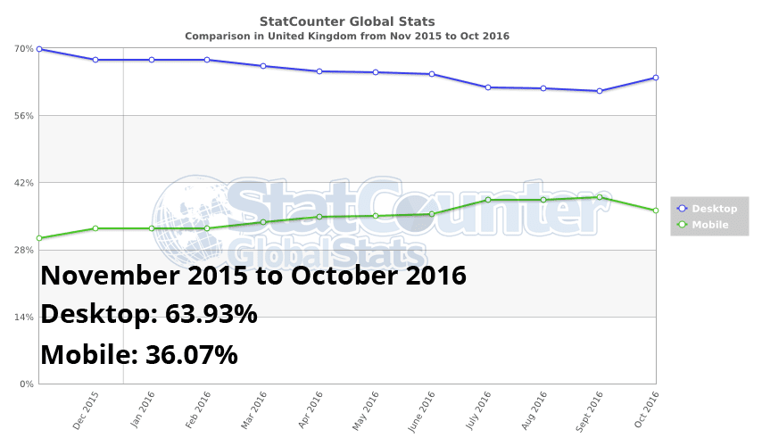
  • Mobile will play a bigger role.
  • Live streaming to open new marketing opportunities.
  • The Monetisation of mobile messaging apps.
  • Social Media Buy Buttons will Reshape the E-Commerce
  • Smartphone usage trends require a multi-channel strategy.
  • Shopping Virtually With Augmented and Virtual Reality (AR & VR).

Overall, November will likely chalk up a good start to the 2016 holiday shopping season, but this year it also marked a change to the cadence of holiday, with the shopping activity taking on a new, more spread-out rhythm.

So, What Does That Mean For Online Retailers?


Well, it means online retailers will have to shift their Black Friday & Cyber Monday strategy for whole November and focus more on eCommerce and try to cut into Amazon’s dominating Black Friday presence (This year, Amazon accounted for 35.7% of online sales on Black Friday; Best Buy was second with 8.23%.4). In order to do so, I suggest they focus on 2017 Online Retail Trend Mentioned Above to help ensure their Success.

Online Retailers would get benefit from spreading their promotions out over an entire November, making adjustments along the way, instead of betting it all on just Black Friday & Cyber Monday. Logistics would be easier to manage, not to mention that they’d avoid the headaches related to the hordes of shoppers that can grind some stores – online or physical - to a halt during Black Friday weekend.

If you have any doubt that social media can be powerful conversion tools, think again! Social media rarely reports as much conversion as Pay Per Click Advertisement, Organic Traffic or e-Mail Marketing, but it's powerful tools for strengthening brand ownership and values ​​in social networks. In short, this is a valuable tool to accelerate the transformation of "follower" into your next new customers. Although, Facebook brought 64% global social sales, you should still be in Instagram, PinterestPolyvoreWanelo, etc social shopping site.

Welcome & Say Hello To The New Cyber November, or should I say, Black November.

Google’s AMP: Designed for Speeding up the Web by Changing How It Works


Google's announcement at Oct 7, 2015 about the Accelerated Mobile Pages Project (AMP), which "aims to dramatically improve the performance of the mobile website" or, alternatively, fragments the Internet by not fully supporting the very standards the web is built upon - depending on your point of view. As well as that announcement they have launched the AMP Project Website (which I discuss in more detail below). So is it a good and necessary step forward or a massively step backwards?

In August 02, 2016, Google announced Accelerated Mobile Pages (AMP) would be moving beyond “Top Stories” into the main organic mobile search results. Today, AMP officially rolls out broadly in mobile search.

In this article I'll explain what is google AMP, How AMP Works, it's advantages & it's impact on google search results.

So, What's Google AMP?

Publishers are cooling on Facebook Instant Articles & Apple News, they’re becoming hot and heavy with Google AMP, the search engine giant’s answer to Instant Articles.

In February, 2016, Google rolled out AMP, which stands for Accelerated Mobile Pages, on mobile search results in Google News. Publishers scrambled to adopt Google’s open-source code on their pages because search still drives close to 40 percent of referral traffic overall, and they know that as their audiences shift to mobile, having fast mobile pages can only help them get surfaced by Google’s algorithm.

AMP's kind of  projects like the Facebook Instant Articles and Apple News.

So, let's talk about how this might actually show up in search results. So first of all, what we know at the moment AMP is  looking like it's mobile only. It's showing up as a carousel above the regular blue links, typically for news-related terms, because most of this is focused on obviously reading contents. The people who've rolled this out first have been mostly news & advertisement publishers Washington PostUSA Today NetworkGizmodoWIREDSlate MagazineplistaRelay Media, etc. So you search for a news-related term. You can see this carousel of swipe-able images above the blue links. Click on one of those, it opens super fast, that's the whole point, and then you can swipe to another AMP page across the way.

Benefits of Accelerated Mobile Pages?

Speed Matters Most and Instant Loading is the Ideal Expectation. Research has shown higher bounce rates associated with slower-loading web pages. Using the AMP format will make it far more compelling for people to consume and engage with much more content.

AMP HTML is a way to build web pages for static content that render with reliable, fast performance. It is Google and Twitter's attempt to make really fast mobile pages. At its essence, it's basically a stripped-down form of HTML, a diet HTML if you will.

How Does AMP HTML work?

The AMP format is supported by a wide variety of platforms, including Google Search. If a web page listed in Google's search results has a valid AMP version website, Search may direct mobile users to the cached AMP.

All of Google Webmaster guidelines for making a site Google-friendly also apply to AMP. This article covers additional recommendations to help you and your website users take advantage of AMP's benefits. Here's a the summary:

Design: Create web pages according to the AMP specification.
Discovery: Make your AMP discoverable.
Validation: Test that your page is written in valid AMP HTML.
Structured data: Mark up your content with structured data.
Status: Monitor your AMP report on Search Console for errors.

But What About Advertisements?

Although JavaScript is mostly forbidden on AMP sites, there are some loopholes that allow publishers to include advertise, analytics, and other pieces of JavaScript on an AMP page.

AMP includes a special analytics tag that allows publishers and advertisers to send data to pre-screened analytics providers such as Adobe, Chartbeat, and Parse.ly. This is handled by a single JavaScript file instead of a separate script for each analytics provider. That file is loaded from Google’s own servers, which can speed things up considerably for pages that use multiple analytics providers. Ads work in a similar way.

The AMP Project vets analytics servers based on performance, security, and privacy, so some of the worst offenders may be screened out. But those who want to use analytics code or other pieces of JavaScript library that haven’t been pre-approved can also use the <amp-iframeiframe> tag.

The <amp-iframeiframe> tag, similar to the traditional HTML version of the <iframe> tag, allows publishers and advertisers to add blurbs of JavaScript hosted on their own websites, but there are some restrictions too. Code inserted into iFrames won’t have access to all the data that a script inserted directly into a traditional page does. AMP always loading the page’s core content before any <amp-iframeiframe> content in order to keep <amp-iframeiframe>s from slowing down pages. And when AMP pages are hosted on Google’s servers, the pages are pre-rendered, so that they still load quickly.

These workarounds enable more freedom for publishers and advertisers, but it also means there’s still room for them to serve invasive scripts to readers. Improved performance won’t always mean improved security, and privacy. It also means more of the web will be shaped by Giant like Google & Twitter.

AMP Supported Browsers?

In general AMP supports the 2 latest versions of major browsers like Chrome, Firefox, Edge, Safari and Opera. AMP support desktop, phone, tablet and the web view version of these respective browsers.

Beyond that, the core AMP library and built-in elements should aim for very wide browser support and accept fixes for all browsers with market share greater than 1 percent.

In particular, Google try to maintain "it might not be perfect but isn't broken"-support for the Android 4.0 system browser and Chrome 28+ on phones.

How AMP works in Mobile Device?

Google has published a great tutorial on how to create your first AMP page. We will go through a quick rundown on what is involved and what you need to know. It is important to know how AMP works in SERPs. In most cases, Google will only serve AMP pages to mobile devices. However, Google does not penalize users who have AMP-only pages (i.e. no additional HTML desktop version) such as the ampproject itself. Google has a preview up but you can emulate it from your desktop using Chrome DevTools.

AMP Page Specialty:

  • Allows only asynchronous scripts
  • All CSS must be inlined
  • Styles are limited to 50KB
  • External resources like images must state their size in HTML
  • All Javascript must be out of critical path
  • No user written Javascript is allowed, only AMP supported
  • Fonts must be loaded with a link tag or a CSS @font-face rule


AMP Impact on the Google SERPs

Simply put, AMP will affect huge in search engine optimization. After all, Google is committed to pushing mobile-first index in which mobile-friendly websites received a rankings boost. The difference here, however, is that AMP is not a ranking factor; at least it isn’t one as of now. This was confirmed in a Google+ Hangout with Google Webmaster trend analyst John Mueller.

AMP will affect in Google SEO in regards to impressions, clicks, user experience, and of course, website speed. Speed is a crucial factor to ranking well on Google and the company reported last year that, “29 percent of Smartphone users will immediately switch to another site or app if it doesn’t satisfy their needs,” and that “. . .of those who switch, 70 percent do so because of lagging load times.”

Yet no matter if AMP is a current organic ranking signal or not, the chances of it becoming one are relatively high as a Google's January 20, 2016 Announcement, which delved into the ad experience on AMP stated that, “We can’t emphasize enough that this is just the start,” and that Google is, “. . .invested for the long term.” With how heavily Google underlined the importance of mobile-friendliness with Mobilegeddon, it would come as no surprise if Google one day made AMP a ranking factor as well; possibly even as soon as its mobile update this May.

Do you think Google will make AMP compliance a ranking factor? I don’t know if Google will make AMP a ranking factor or not but AMP will be a real headache for publishers, that is certain. In order to keep up and not lose positions they will be forced to learn everything about Google AMP.

SEO Your AMP Pages?

By having an AMP version of your post or page you don’t want to get dinged for duplicate content, so Google requires that you use the canonical tag when linking to pages.

Google will automatically detect AMP pages on your site as your original page is served with a header tag directing Googlebot to your AMP page.

What Can You Do To Prepare?

There's two things. Firstly, you want to be able to start building AMP pages for your site, and you want to make sure that those pages are valid, because as we said, it's like a diet version of HTML, but it's very, very strict on how you build the HTML. The tags have to be in certain orders and certain places. You can't use certain things. And if you do any of that, your AMP page is invalid and they probably won't be using it.

There are several ways available to validate an AMP document. They will all produce the exact same result, so use whichever one suits your development style the most.

Chrome Developer Console:

To validate your AMP pages, you can use a tool that's built into Chrome. So if you open the developer tools in Chrome, there's a system there — and you can look it up on the AMP project website — where you can actually go to a page and you can ask it to validate, "Is this an AMP page," and it will tell you any problems with that page.

Web Interface:

There's also a Web Interface available at validator.ampproject.org. This interface shows errors displayed inline alongside the HTML source of the page. The interface is an interactive editor: changes to the html source result in interactive revalidation.

Chrome:Browser Extension:
The AMP Validator can be accessed directly from your browser's toolbar using a browser extension. As you browse, it will automatically validate each AMP page visited and gives a visual indication of the validity of the page as a colored icon.

Summery: Want to Convert your site to Google AMP? Contact Us Today & we'll get back to you.

Things You Need To Know About Google’s ‘Mobile-First’ Indexing


Here's everything you need to know (technically worry) about the Google Mobile-First Search Index.

Why Does Google Switch To ‘Mobile-First’ Search Result?

Google's internal research found that the majority of Searches on Google are done via Mobile devices. Google's aim to deliver relevant results to the majority of their searchers. Until now, Google has indexed web pages as desktop browsers see them. With the new ‘mobile-first’ search index approach, Google indexes web pages as mobile phones see them. The rankings will be based on the mobile websites priority then desktop website.

Nutshell is the mobile version of your website will become more & more important for SEO than the desktop version.

What is Changing with the Mobile-First Search Index?

As more and more google searches happening on mobile, Google wants its index and results to represent the majority of their users — who are mobile searchers actually. Google has started to use the mobile version of the web as their primary search engine index. A search engine index is a results of pages/documents that the search engine discover, primarily through crawling the world wide web through links. Google has crawled the web from a desktop browser point of view, and now Google is changing that to crawl the web from a mobile browser view.

The most substantial change will likely be that by having a mobile index, Google can run its ranking algorithm in a different fashion across “pure” mobile content rather than the current system that extracts data from desktop content to determine rankings.

What if You Don’t have a Mobile Friendly Website?

Google said not to worry. Although Google wants you to have a mobile friendly website, it will still crawl your desktop version of your website instead. Google said,
If you only have a desktop site, we’ll continue to index your desktop site just fine, even if we’re using a mobile user agent to view your site.
If you have a mobile friendly website, then you need to make sure the website content and links on the mobile site are similar enough to the desktop version of your website, so that Google can consume the proper content and rank your site as well as it did by crawling your desktop website.

Test your website with Google's New tool.

Don't Have a Mobile Friendly Website? Contact Here

What do You Have to Do if you Have a Mobile Friendly Website?

You have to make sure that your mobile website contain enough related & high quality content to rank your pages on google search. If your mobile website have less content than your desktop pages, your pages might get lower rankings with Google’s new ‘mobile first’ search index.

My Mobile Site has less Content than my Desktop Version. Should I be Worry?

Potentially, yes you should worry about it. Google has said that it will look at the mobile version of your site. If that has less content on webpage "X" than the desktop version of webpage "X", then Google will probably just see the mobile version with less content. This is why Google recommends you go with a responsive design approach — the content is the same on a webpage-by-webpage basis from your desktop to your mobile website. You can do the same with other mobile implementations, but there is more room for error.

What is the Best Solution to Make Sure that Google can see the Content of My Webpages?

Google Recommends responsive web design. The content on responsive websites is the same on desktop computers, tablet and mobile devices. The layout changes based on the media device that is used to view the content but the content is the same. Of course, you can also create a separate website just for serve mobile.

Responsive websites will benefit the most and will be well placed for the change. However, websites which have a separate mobile site will suffer the most as a strong focus on optimization will be necessary to get them up to speed if they’ve been neglected in the past.

In general, a separate mobile website lead to more work and more errors can happen.

What About Expandable Content on Mobile Device?

With your desktop sites, Google said that content hidden in tabs, accordions, expandable boxes and other methods would not be weighted as high. But when it comes to mobile search index, Google’s Gary Illyes said content like this will be given full weight if done for user experience purposes. The idea is that expandable content makes sense on mobile device and not so much on desktop.

Will My Rankings Change a Lot?

At the moment, it’s still too early to say about it. But note it, that Google is prioritizing mobile content.

Google's Representative says that there should be minimal ranking changes around this algorithm change. Of course, most websites already have good mobile friendly or responsive sites. If you do not have a mobile friendly website yet, your rankings might change more than the rankings of a website that already is mobile friendly. Pages that are not mobile-friendly will not rank as well as pages that have been optimized for mobile devices.

I suggest a SEO audit ? Contact Here

Will Google Have Different Indexes for Mobile Search and Desktop Search Results?

We know Google has been working on creating a separate mobile index for a while now, but with mobile searches now accounting for more than 50% of all searches, it’s making more sense to priorities a more relevant and positive user experience for users on mobile devices.

Although we’ve had some pretty obvious clues that Google search is become more mobile-orientated with the advent of ‘Mobilegeddon’ The Google Mobile Friendly Update On April 21, 2015 and the introduction of AMP in February this year, it’s now clear that Google is taking his search algorithm a step further.

Currently, Google search is set to become mobile-first & has a single index for search across desktop and mobile, but last week Google’s Gary Illyes confirmed at Pubcon in Las Vegas they are going to create a separate, rapidly updated mobile search index, which will become the primary index used for search.

A secondary desktop index will be in place, but won’t be as up-to-date as the mobile index. We don’t know exactly when the changes will be rolled out, but it will likely only be a matter of time.

When Will This Fully Roll Out?

Google's Representative said they have already begun testing this mobile-first search index to some users. But it looks like we are still months away from this fully rolling out. Google won’t give us a date because they are still testing the roll-out, and if things go well, they may push it sooner. If things do not go well, they may push it back. Google did say they will push this out to more and more searchers over time as they become more confident with the mobile-first search index.

What Happens to the Links that Point to My Website?

If you have a responsive website, you do not have to worry about this because the URLs of your mobile pages and your desktop pages are the same (actually, the pages are the same, they are only displayed differently on mobile and desktop).

Is This a Mobile-Friendly Website Ranking Boost?

Google has previously said that the website content that’s not mobile-friendly will not rank high on organic search. That remains the case with this new index too. In the current index, which most people will continue to get results from, desktop content is indexed and used for showing search listings to both desktop and mobile users.

A special mobile-friendly ranking system is then used to boost website content for Google’s mobile listings. Content that’s not mobile-friendly doesn’t perform as well. In the new mobile-first index, which some people will get results from as Google rolls it out, mobile content is indexed and used for showing listings to both desktop and mobile users. Then the mobile-friendly ranking boost is applied, as with the current system, to mobile-friendly pages.

Want to Boost Your Website Ranking? Contact Here

How Can I Tell if Google Sees My Mobile Pages?

The best way is to use the Fetch and Render tool in the Google Search Console. Specify the mobile:smartphone user-agent and look at the preview after the fetch and render is complete. What Google shows you in the rendered results is likely what Google can see and index from your mobile website. If content is missing, then you should look into how to fix that and run the google tool again.

Will Links and Rankings Change Because of This?

There is a concern that mobile content tends to have fewer links than desktop content. This is a concern that is similar to the concern listed above around mobile content having less content than desktop content. Google’s search results are very dependent on links and content. So if both links and content are impacted, will the rankings be impacted? Google said they are still testing, so it isn’t 100 percent clear. Gary Illyes said,
I don’t want to say anything definite about links yet. It’s too early for that cos things are very much in motion.

Canonical URLs: Shall I Need to Change Them?

Google said the canonicals will not need to be changed, just keep your canonical tags as is, and follow their recommendations as listed on their blog post. They Said,
Sites do not have to make changes to their canonical links; we’ll continue to use these links as guides to serve the appropriate results to a user searching on desktop or mobile.

Can I See the Change and The Impact in the Search Results Now?

Google said you shouldn’t be able to see the change and impact of the mobile-first search index roll-out now. In fact, Google said it hopes there is little to no impact after it is fully rolled out. Paul Haahr Software engineer at Google said,
I would be very surprised to detect any effects of mobile-first indexing at this stage.

Will Bing Search Move To Mobile First Index Too?

Some have been wondering if Bing Search Engine would follow in Google’s footsteps and do a Mobile First Index, similar to what Google recently announced. Google will be changing their desktop index to one where they index the mobile version of a website, in order to serve mobile users – which now account for more than 50% of all searches – the most accurate search results.


Christi Olson Bing Evangelist at Microsoft says that they have no plans to do a Bing “mobile first” index. Their index will remain as a desktop index, meaning they will continue to index the desktop version of a webpage, and not the mobile version of the page. She Said,
At Bing, we maintain a single index that is optimized for both mobile and desktop to ensure our users continue to receive the most relevant, fresh and consistent results no matter where they are.
Want To Rank Higher on Bing & Yahoo Serch? Contact Here

Although Google said they have already begun testing this mobile-first index to some users, it will still take some time until it goes live for all users.

Priority to the Mobile at Google Search

Mobile at Google Search
Since November 2016, the main Google search index is mobile

While Google Search Result Pages has always been based on desktop version of the websites, is now the mobile version which significantly indicate Google Search Core Algorithm Changes.

Mobile, The Google First Priority

Why Does Google Priority The Mobile-First Search Results?

As Google explained in its webmaster central blog official announcement at Nov. 4, 2016, the change was necessary because of the paradox:

Today, most people are searching on Google using a mobile device. However, our ranking systems still typically look at the desktop version of a page’s content to evaluate its relevance to the user. This can cause issues when the mobile page has less content than the desktop page because our algorithms are not evaluating the actual page that is seen by a mobile searcher.

The announced change therefore makes more coherent analysis of Google:

To make our results more useful, we’ve begun experiments to make our index mobile-first. Although our search index will continue to be a single index of websites and apps, our algorithms will eventually primarily use the mobile version of a site’s content to rank pages from that site, to understand structured data, and to show snippets from those pages in our results. Of course, while our index will be built from mobile documents, we're going to continue to build a great search experience for all users, whether they come from mobile or desktop devices.

In the next paragraph google assured that, although this is a big algorithm changes but all user still get great user experience as always.

Accuracy: throughout this article, as in the communication of Google unless stated "mobile" means "smartphone". This does not include tablets, which are closer to the computers.

Is Google Mobile-First Index Already in Place?

No, I don't think so, Even the announcement is official made since early November 2016, Google's Mobile-first Indexing is still in a testing phase. As the impact can be major (for small businesses, blogger, solopreneur and professionals to make sure that their websites are mobile friendly, for example), Google warned in advance.

Is The World Really Happened To The Mobile?

I went to see the Global internet usage statistics provided by web analytics company StatCounter, what I found is very interesting: StatCounter Global Stats found that mobile and tablet devices accounted for 51.16 percent of worldwide internet usage in November 2015 to October 2016, compared to 48.48 percent via desktop. Indeed the trend is globally clear.

Google Mobile-first Indexing
Proportion of Internet Usage WorldWide in October 2016

But when I looked closely at the comparison map, I realized that Mobile usage surpasses desktop for geographical areas like Asia and Africa where the mobile has majority share, but this is not the case of Europe, Canada, United Kingdom, Australia and Even United States of America (But For How Long?).

In USA, there would be only 36.5% of digital media time represents by Mobile, while the desktop is 63.50%.


In Canada, there would be only 26.96% of mobile internet user compared to 73.04% of desktop internet user.


In United Kingdom, While an estimated of 89.90% of U.K. citizens using the internet today (Source: https://hostingfacts.com/internet-facts-stats-2016/) , there would be only 36.07% of mobile internet user.


Global Mobile Consumer Survey 2016 UK Cut: Deloitte Touche Tohmatsu UK Limited conducted an SmartPhone Usage Survey, Here're the Key findings:

  • Almost half of 18-24 year olds check their phone in the middle of the night.
  • 27% of smartphones include a fingerprint reader, of which 76% are used.
  • Connected home devices still haven’t taken off, with just 2% of adults owning smart lights and smart appliances.
  • As of mid-2016, almost half of UK adults had access to at least one type of connected entertainment product.
  • 4G adoption has more than doubled in the last year, from 25% to 54%.
  • 31% of smartphone users make no traditional voice calls in a given week. This contrasts with a quarter in 2015, and just 4% in 2012.
  • The majority of survey participants have downloaded 20 or fewer apps.
  • By mid-2016, almost two-thirds of UK adults had access to a tablet, but penetration growth had slowed down.


In Australia, there would be only 37.76% of mobile internet user compared to 62.24% of desktop internet user.


In Europe there would be only 31.22% of mobile internet user.


What Difference Does It Make In Practice?

It depends on whether your website is mobile-compatible, and if so in what way (there are 3 ways).

Mobile websites via responsive design:

In this scenario, the website automatically adjusts to the available screen width (in pixels). The website URL will the same (between the mobile version and the other) and no detection of the type of media device is required. If this is your case, you have nothing else to do than to check what happens when Google visits your site. Please, test your website with Google Mobile-Friendly Testing tool.

Mobile websites via the dynamic serving:

In this case, the design automatically adjusts to the available width (in pixels). The URL is the same (between the mobile and the other version). The only difference with responsive design is that the content (source) differs depending on the type of media device (which must therefore be detected), the idea being to ease the mobile version. If this is your scenario, you have nothing else to do than to check what happens when Google accesses your site. Please, test your website with Google Mobile-Friendly Testing tool.

Mobile version of your websites via a new mobile only URL:

In this scenario, two sites (or pages) are created: one for the desktop browser & the other one for mobile user. There are quite a few things to do for Google sees this mobile-compatible, but if it is OK then it is as effective (in terms SEO) than other methods. If this is your case, take a step back and ask what is different (in terms of website content and structured data markup) between the mobile version and desktop version.

If your website's mobile version has less content than the other version, then you risk seriously to see your Google organic search traffic decrease, especially on the long tail keywords. Indeed, removing words or phrases, you reduce your chances out in the SERPs on queries that reference.

Websites that do not compatible with mobile:

In this case, it really is time to plan a new version of your website, obviously compatible with mobile! Because not only do you risk having problems in SEO (Google based on the mobile version first), but most of your website user will not be happy website your website.

Need Help Setting Up Mobile Compatible Website? Contact Us

A Mandatory Test For Everyone!

Be sure to follow these 3 essential tips:

  • First, test your website with google new mobile compatibility testing tool to make sure your site is compatible according to Google guideline. You should test your website all URL individually, because Google tool only evaluates the URL we provide not all of it's inner pages.
  • Then run the "Fetch as Google" tool in Google Webmaster Tools interface. Remember to configure the search robot to mobile version (it is still not selected by default ... like what Google is outdated). I advise you to enjoy it to request a display, you can render your page according to Google. It is on this version that Google will now be based to estimate the quality of your site.Suffice to say that it is imperative that everything is OK! By the way, make sure you do not block Google's access to resources necessary for rendering on mobile ( CSS , JS , images).
  • Finally, test your website with google's structured data markup testing tools. And see if you inserted structured data markup correctly (like Organization, Address, etc). Reread the article in Google Webmaster Central and you'll see they speak several times about structured data markup, as it is important.

Read This Week SEO Trend.

Do You Make Your Search Engine Optimization (SEO) Too Complicated?


The week is coming to an end again and I'm holding you a moment off the weekend to present you the best SEO News of the last week. Do You Make Search Engine Optimization (SEO) Too Complicated? What is SEO? How does 301 Redirect affect SEO? Questions about questions and I'm OK to answer you again. Have fun while reading this article.

In search engine optimization, there are many methods can be used to increase any website search engine organic ranking. Prior to execute any strategy, goals must first be defined. A suitable strategy can then be developed from these goals. There are a few simple questions you can ask yourself:

What is the purpose of my website?: Do I want to generate leads? Do I want to sell a product? Do I want to distribute content? The purpose of a website is directly dependent on the goal to be defined first.

What will I achieve?: Is it revenue based? User based? Traffic based? The definition of what you want is crucial to the success of the strategy.

How can I measure my success?: After you know what you want to achieve, you have to know how to measure your success. If, for example, you want to generate leads, you need not only traffic on the website, the traffic must also need to convert to leads. What will bring you a thousand visitors when none of them convert?

Who are my competitors?: knowing your competitors is important. By monitoring the competition, you can easily identify and exploit gaps in their SEO strategy.

Once the goals are set, a strategy must be developed. In doing so, it is important to keep the focus on the objectives and to sort out everything that does not correspond to your goal. At this stage of the process, you should already consider the partners you need to work with. In order to operate successful SEO strategy, sometimes, you may have to rely on others at some points.

The next phase of the process is to review the results. The focus should be on everything that has a clear influence on the achievement of the goal. There are four simple questions to be asked.

  • What has worked?
  • What did not work?
  • Why did not it work?
  • What's next?

The aim of these questions is to find out if you are on the right path. At some points you can not answer all these questions. Through the questions you make sure that you does not lose the focus. One of the most important questions is the fourth one.

After all the results have been analyzed & solved the question, time adjustments have to be made. Based on the collected data, the strategy can be reoriented and improvements can be made to achieve the goal and restart the process further.

Google New Page Speed & Mobile Friendly Tool before: The new All-In-One tool from Google allows website owner or webmaster to check the Mobile friendliness, mobile speed & desktop speed in no time. As with the Google PageSpeed ​​Insights Tool, the user is given helpful tips on how to fix the issue.

301 Redirect?: A 301 redirect is the HTTP status code for when a page has been moved permanently to a new location or URL.

With a 301 redirect, the value of inbound links as well as historic/trust records for one URL will move to the other, though there’s debate as to just how much of this benefits are passed on to the new URL.

301 redirects are particularly useful in the following circumstances:

  • You've moved your site to a new domain, and you want to make the transition as seamless as possible.
  • People access your site through several different URLs. If, for example, your home page can be reached in multiple ways - for instance, http://example.com/home, http://home.example.com, or http://www.example.com - it's a good idea to pick one of those URLs as your preferred (canonical) destination, and use 301 redirects to send traffic from the other URLs to your preferred URL.
  • You're merging two websites and want to make sure that links to outdated URLs are redirected to the correct pages.

To implement a 301 redirect properly for your websites that are hosted on servers running Apache, you'll need access to your server's .htaccess file.

New Google Accelerated Mobile Pages: Google AMP is still rising. More and more websites offering AMP versions for their mobile users.

Ads on AMP Website
Ads on AMP Website Study by AMP Project


Google's Project Amp prevails slowly but surely, and more and more sites offer a quick AMP version of the content, which can be loaded much faster on smartphones. Since, of course, such websites must also be financed, Google has made possible a number of advertising forms from the beginning, which are now to be expanded. Soon there will be three new forms of advertising.

  • Sticky Ads
  • Flying Carpet Ads
  • AMP Ads for Pages

Read More From AMP Blog.


'Mobile-First Indexing ' Google’s Begins Making a big change to Organic Ranking and Appearance

Google Mobile-First Indexing


As we know, Since 1997 Google has used the desktop version of websites to determine it’s search relevance and organic ranking signals in order to populate its organic search index.

Google has begun testing mobile-first indexing, using mobile content to determine it’s search relevance and organic ranking signals, which will primarily look at the mobile version of your website for its ranking signals and eventually fall back on the desktop version when there is no mobile version available for user search query.

Most of Google Searches are Mobile

Google realized that most people search on Google using mobile devices, and the company has begun experimentation with switching to a mobile-first indexing methodology last year. This will be of particular interest to webmasters, depending upon the configuration of the websites under their management.

A detailed study released by Google reveals roughly 40% of people search only on a smartphone. More people are searching Google via smartphone than ever before the company says, with the most popular categories revolving around health, parenting, and beauty.

Other top findings from Google’s study include:

  • 80% of people use a smartphone
  • 67% of people use a desktop computer
  • 16% of people use a tablet
  • 57% of people use more than one type of device
  • 27% of people use a smartphone only
  • 14% of people use a desktop computer only


Dissecting these findings, it’s interesting to learn that of the people who only use one type of device, twice as many are using smartphones than desktop computers.

Google acknowledged the significance of the undertaking and wrote on the Webmaster Central Blog:

Today, most people are searching on Google using a mobile device. However, our ranking systems still typically look at the desktop version of a page’s content to evaluate its relevance to the user. This can cause issues when the mobile page has less content than the desktop page because our algorithms are not evaluating the actual page that is seen by a mobile searcher.

Although mobile-friendly sites should not require any changes, Google has made several suggestions for sites that maintain separate markup for mobile and desktop devices. Otherwise, sites optimized only for desktop consumption will continue to be indexed as they are now.

Google wrote:

We understand this is an important shift in our indexing and it’s one we take seriously. We’ll continue to carefully experiment over the coming months on a small scale and we’ll ramp up this change when we’re confident that we have a great user experience.

For websites that do not currently offer a mobile-optimized experience, the news may inspire website owner and webmasters to quickly build and deploy a mobile version of their site. However, Google recommended a more careful approach and advised, as

If you are building a mobile version of your site, keep in mind that a functional desktop-oriented site can be better than a broken or incomplete mobile version of the site. It's better for you to build up your mobile site and launch it when ready.

No mobile site? Where to Start?

So you know that, Google prioritizing mobile over desktop sends a message that Website owners, webmasters and SEOs should do the same. At the very least, this means having either a mobile or responsive version of your website.

Having a mobile-optimized website is not enough for eligible top position on google organic search. In short, mobile-friendly is the bare minimum requirement, You should take care of following issue:


  • Follow Google Webmaster Guidelines.
  • Site Optimize for right keywords.
  • Website Speed Matters.
  • Have a healthy amount of google accessible text on your site.
  • Site images have descriptive ALT tags and filenames.
  • Make sure your site isn’t creating any duplicate content.
  • Have a XML Sitemap.
  • Backlinks from Authority Website.
  • Social Media Presence.


The best way to optimize your site for speed is to publish content using Accelerated Mobile Pages (AMP) technology. If you’re not yet on board with AMP, I would recommend regularly checking on your mobile PageSpeed using Google’s PageSpeed Insights and Mobile-Friendly Test.

Keep load times as low as possible. Ideally, website owners, webmasters and SEOs should have these bases covered before Google splits its search index. No exact time frame was given as to when the split will happen, but in this industry, it never hurts to be proactive.

We will keep you posted

As we see changes to the Google search results and index, we will report back to you with any issues. When this mobile-first index fully rolls out, we will let you all know.